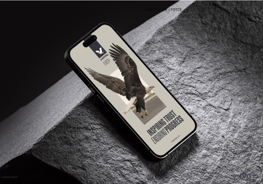
Identity for a new brand in the steel processing industry
Creation and implementation of a visual identity.
SCOPE OF WORK
- Research and Analysis
- Design Scenarios
- Communication Foundations
- Logo Design
- Visual Communication System
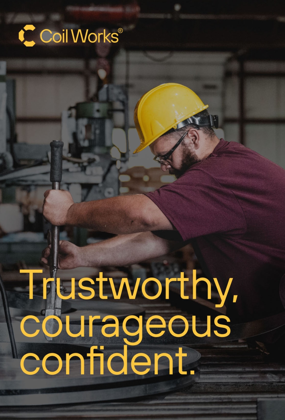
Coil Works is a new company in the American steel processing sector. Its owner approached us with the task of creating a visual identity that conveys the strength of a brand rooted in American history and the values foundational to its creation.
Key goals and project challenges
- Distinguishing the brand’s image from its competitors.
- Gaining an understanding of an unfamiliar industry, its deeply ingrained values, and meanings.
- Developing a brand image that meets the needs of its audience.
- Creating a symbol that serves as both a powerful logo and a piece of the brand’s story.
ARCHETYPE
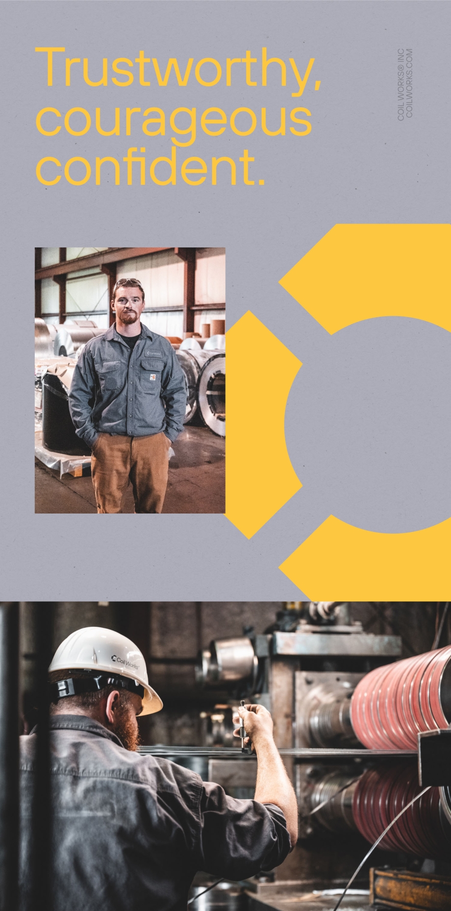
Everyman – The embodiment of the American working class
For Coil Works, the Everyman archetype represents the hard-working, average American. During workshops, the client described men with rough, dirty hands cracking open a beer together on their porch after a tough week of work.
The Everyman archetype aims to highlight belonging, community, and understanding of the daily struggles of ordinary people. It portrays a dependable companion, a figure with a strong sense of justice and high moral values. This is exactly how Coil Works wants to be perceived.
TONE OF VOICE
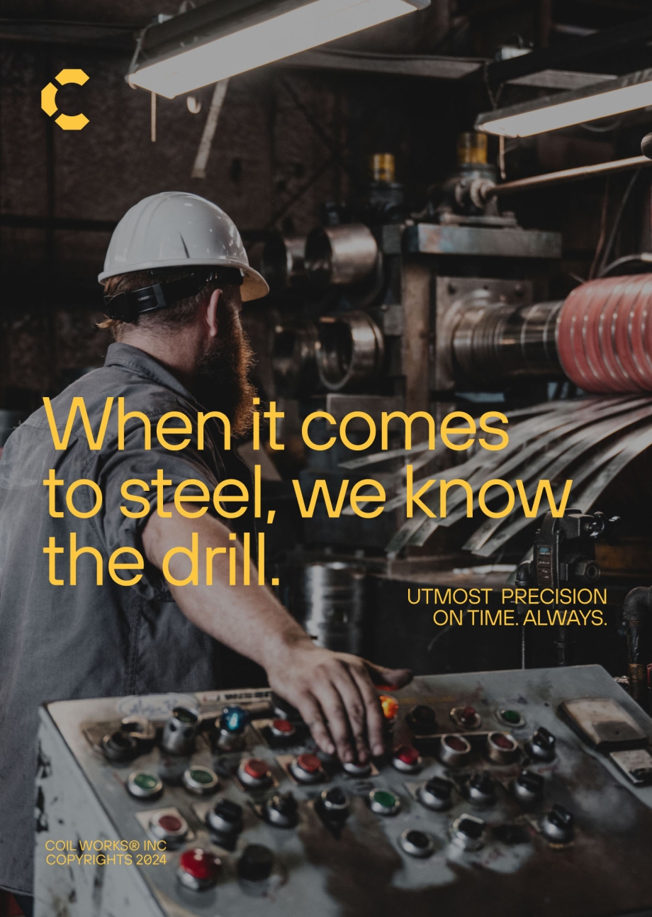
Simple and direct. Friendly and respectful.
The communication style we adopted aims to connect not only with potential employees but, most importantly, with Coil Works’ end clients. The metallurgy industry holds a position of high respect in American culture and requires a professional approach. The key values we wanted to convey were reliability and partnership.

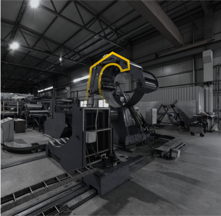
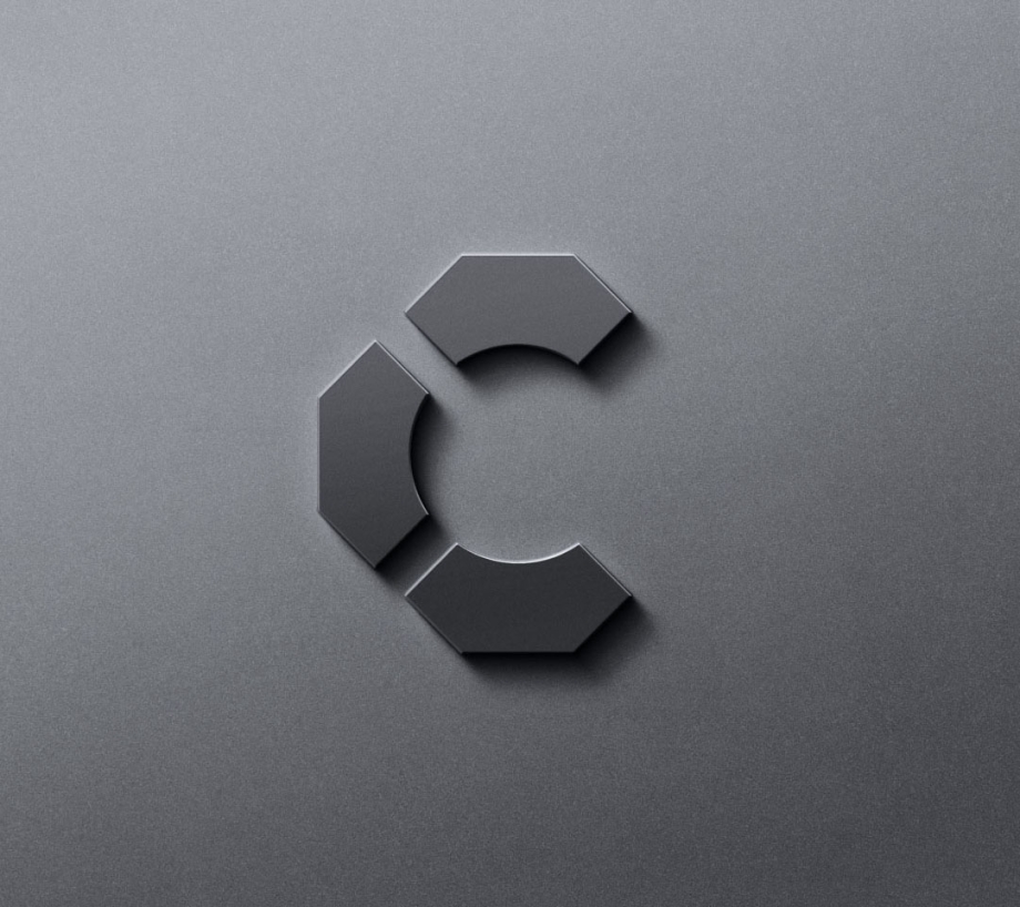
Among the many designs inspired by the various forms steel takes and the elements visible on the production floor, we ultimately chose a simple form inspired by steel processing machines. The minimalist “C,” rooted in the machinery used by our client, clearly and transparently conveys the ideas behind the brand and proudly represents the metallurgy industry.
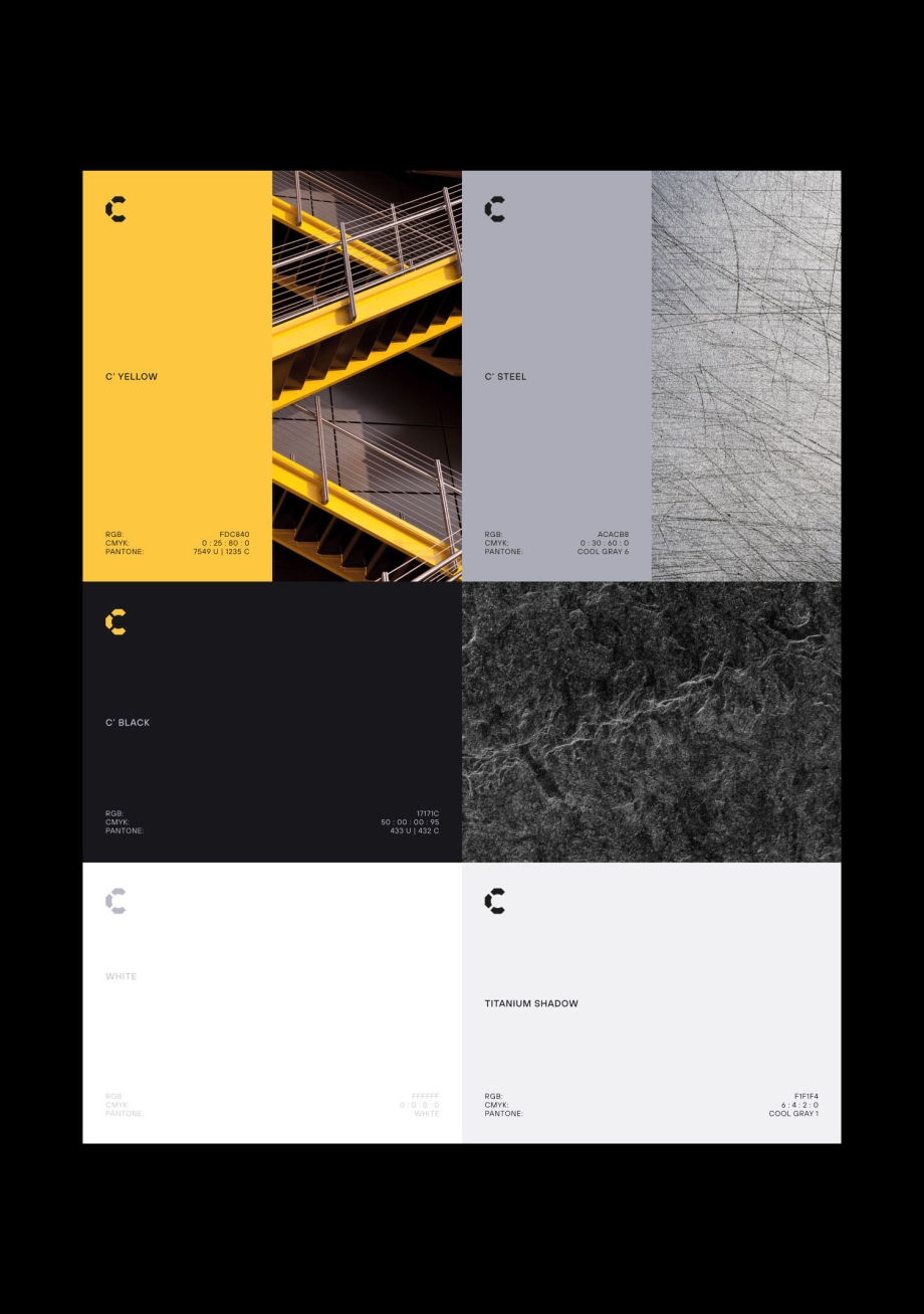
Colors in the brand’s storytelling
Another crucial element of the visual identity, alongside the logo, is color. Once again, we drew inspiration from the metallurgy industry, the client’s values, and the materials they work with.
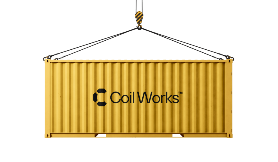
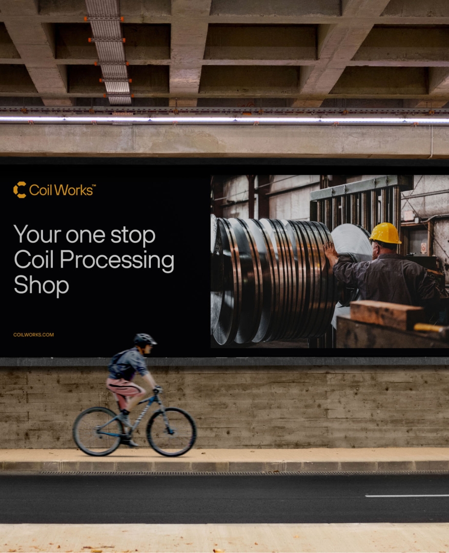
We chose a bold yellow that references the protective helmets worn by workers, symbolizing trust and safety. This accent color, commonly found in construction environments, was paired with cool shades of steel gray to create a minimalist and impactful message.
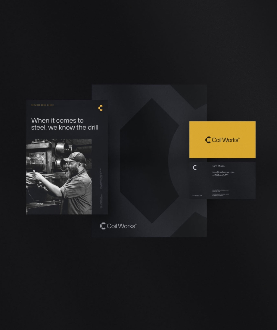
Stationery and marketing materials
Once the design was complete, it was time to put it into practice. We created numerous mockups illustrating the application of the new visual identity in various contexts. We also prepared stationery and other marketing materials.
“Our brand is now well known across the industry and we get compliments on it weekly.”
The IVN team was tasked with a last minute project to build a brand for a Steel Mill business in the US. After a brief and some follow up calls, the team absolutely hit the target with the look and feel of our brand in an industry that is old and established.

Tom Mikes
CEO
Coil Works


How we helped other clients find their voice